Viola Basalaeva. Stockholm-based brand designer. Strategy-led visual identity work across print and digital.
Cases
Visual Identity
Category
Matcha Nova's flavours are named Solar, Lunar, and Tidal — built around the natural rhythms that govern movement and change: the sun, the moon, the tides. The category was full of green, leaves, and zen references, but none of that spoke to what the brand was actually about. The identity needed to reflect rhythm and motion itself, not the plant the drink is made from.
A chromatic fish became the central graphic device — not as decoration, but as a study in fluidity, the same kind of movement that governs tides and currents. It let the identity express the brand's actual concept — natural cycles, constant motion, the pull between calm and energy — without leaning on a single matcha cliché. A restrained grey palette kept the system grounded against that movement, while archive-inspired typography added structure, a counterweight to the fluidity of the fish.
The result is a visual language that mirrors the product's own logic — Solar, Lunar, Tidal — calm yet sparkling, rooted yet constantly shifting.
A chromatic fish became the central graphic device — not as decoration, but as a study in fluidity, the same kind of movement that governs tides and currents. It let the identity express the brand's actual concept — natural cycles, constant motion, the pull between calm and energy — without leaning on a single matcha cliché. A restrained grey palette kept the system grounded against that movement, while archive-inspired typography added structure, a counterweight to the fluidity of the fish.
The result is a visual language that mirrors the product's own logic — Solar, Lunar, Tidal — calm yet sparkling, rooted yet constantly shifting.
A matcha soda identity that deliberately avoids looking like matcha. Built around a chromatic fish and a restrained grey palette instead of the expected greens and zen references.
Matcha Nova Studio
Brand


Visual Identity
Category
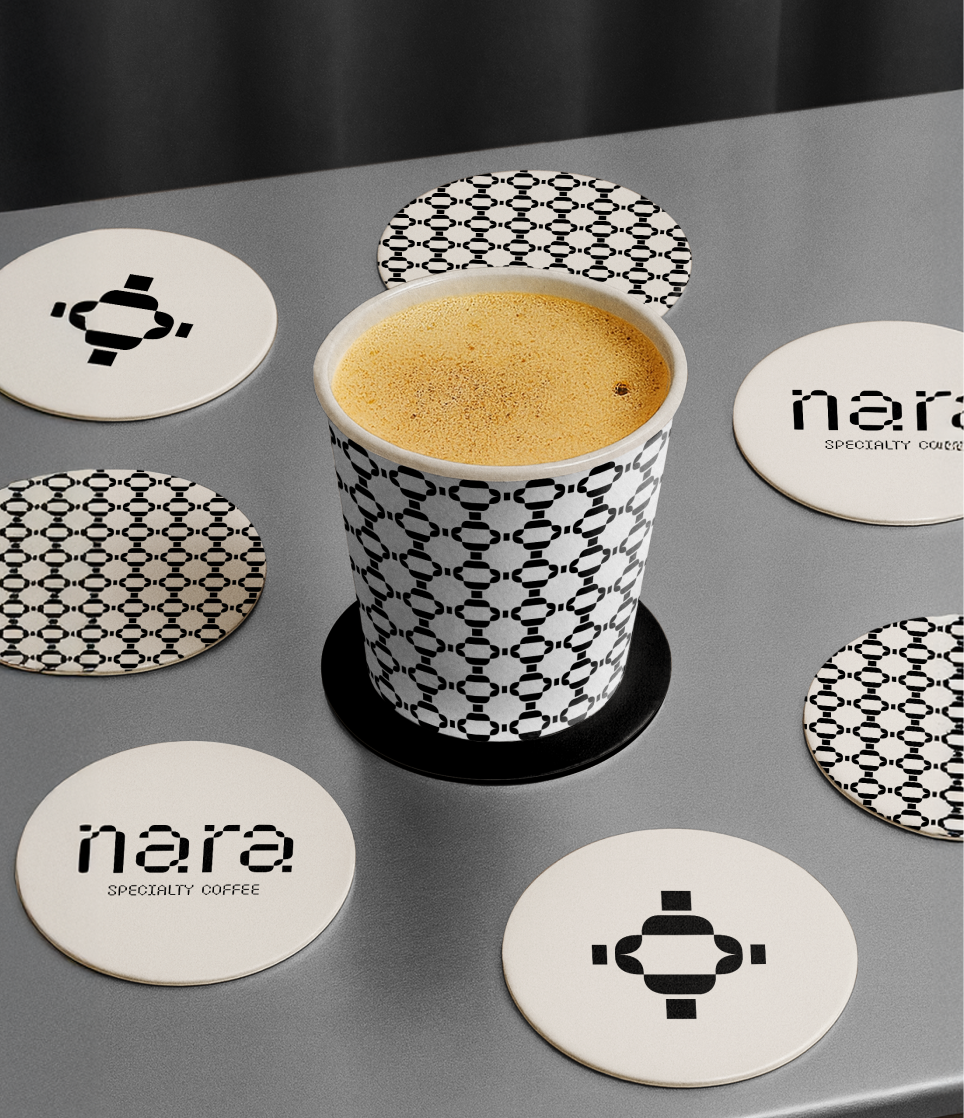
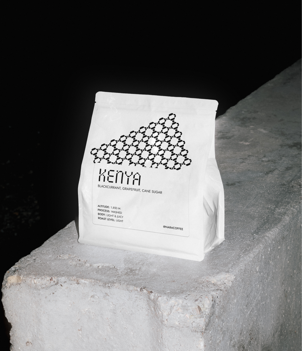
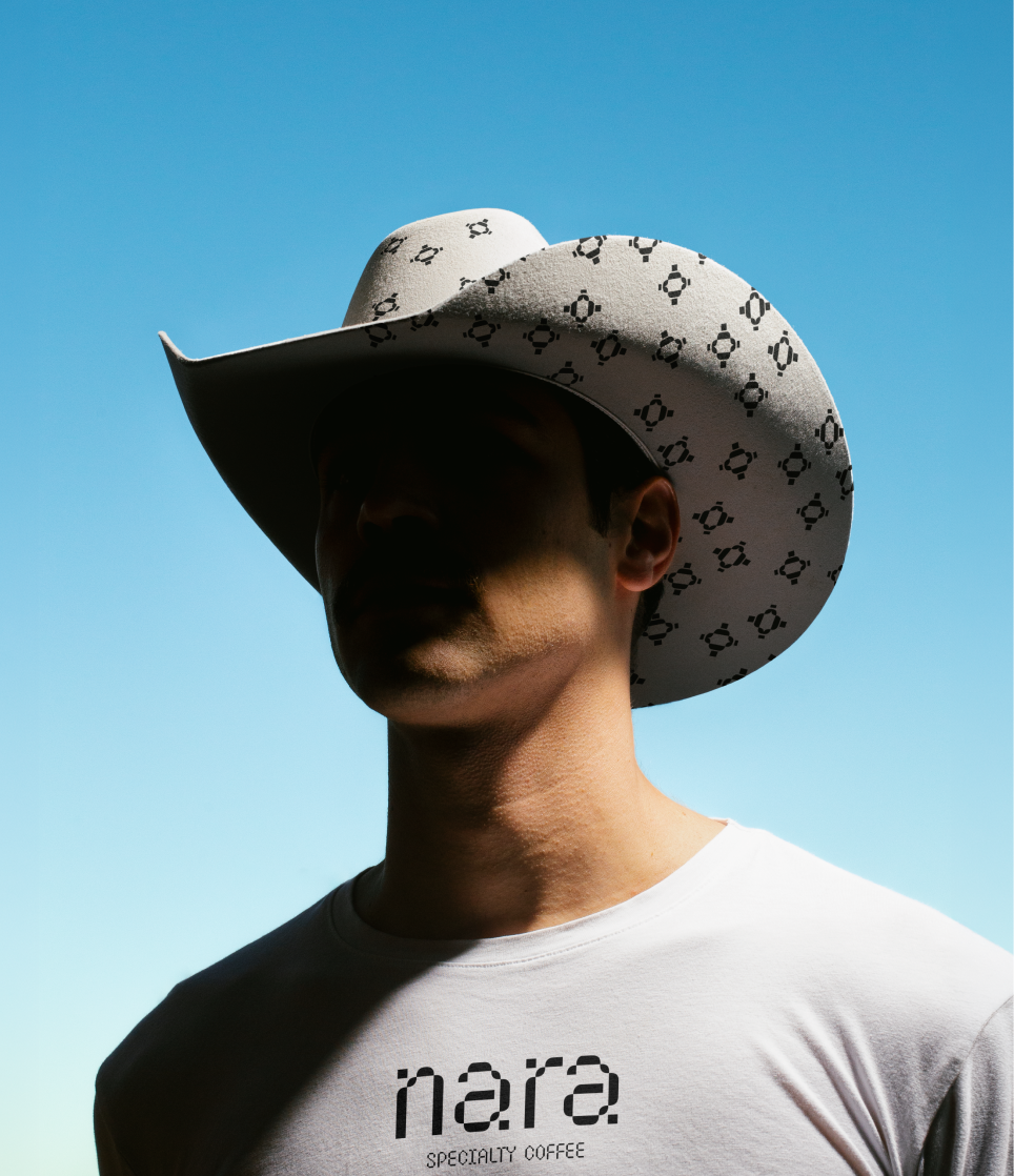
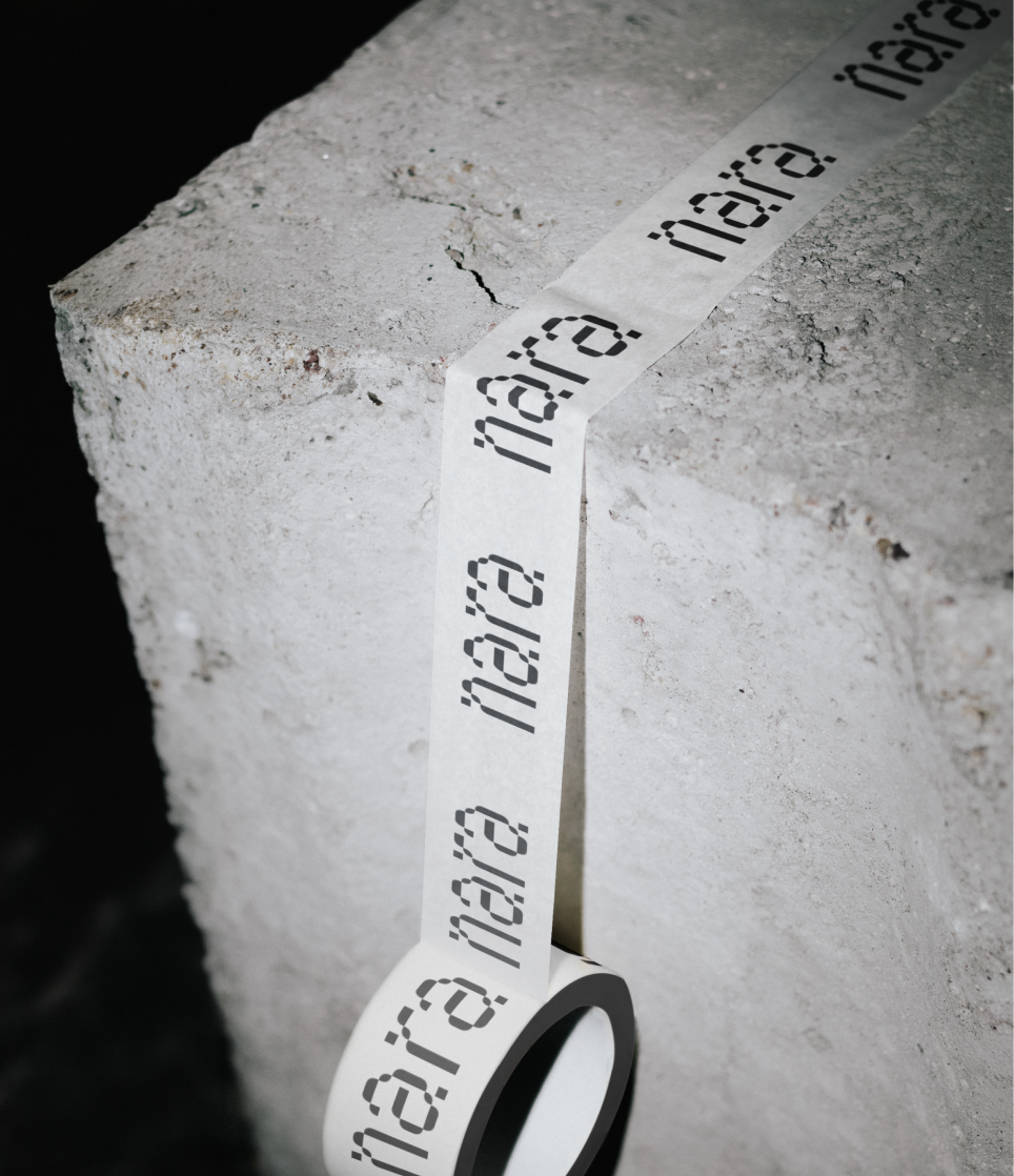
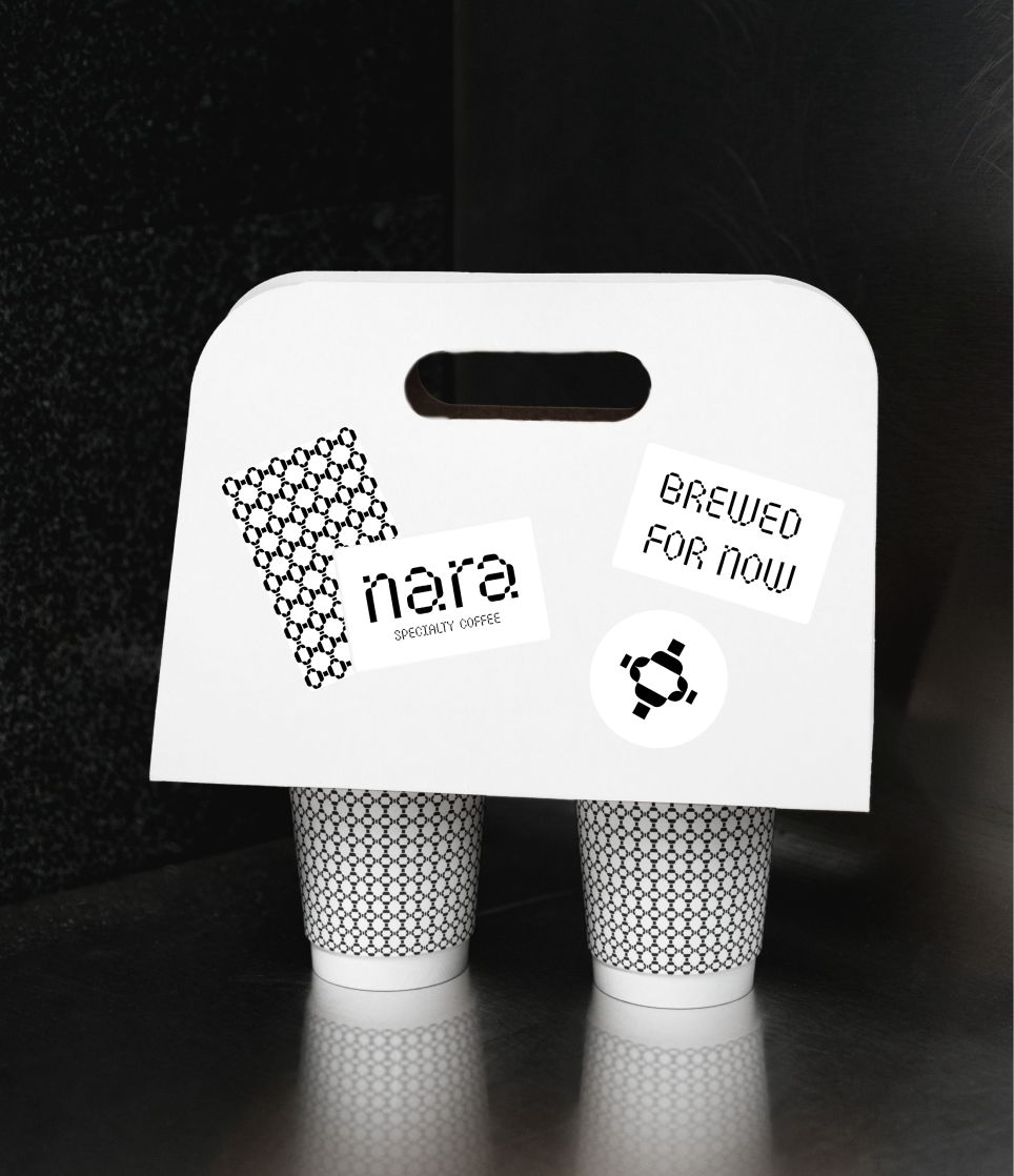
NARA, specialty coffee. The identity is built on a single principle: recognition through repetition, not decoration. A modular black-and-white pattern carries the entire system — coasters, cups, signage — functioning less like branding in the traditional sense and more like an architectural motif, something that belongs to the space as much as to the cup in your hand.
The mark itself stays quiet and geometric, almost typographic in how it's constructed — built from the same repeating units as the pattern, so the logo and the texture feel like two expressions of the same underlying language rather than separate decisions. Monochrome throughout, no colour to lean on, no warmth to borrow. Every surface earns its presence through precision.
On a coaster across the room, on a cup in motion, the pattern does the work a logo usually has to do alone.
The mark itself stays quiet and geometric, almost typographic in how it's constructed — built from the same repeating units as the pattern, so the logo and the texture feel like two expressions of the same underlying language rather than separate decisions. Monochrome throughout, no colour to lean on, no warmth to borrow. Every surface earns its presence through precision.
On a coaster across the room, on a cup in motion, the pattern does the work a logo usually has to do alone.
A coffee shop identity built on pattern, not logo. A modular black-and-white system designed to create recognition through repetition rather than a single mark.
NARA
Brand
Visual Identity
Category
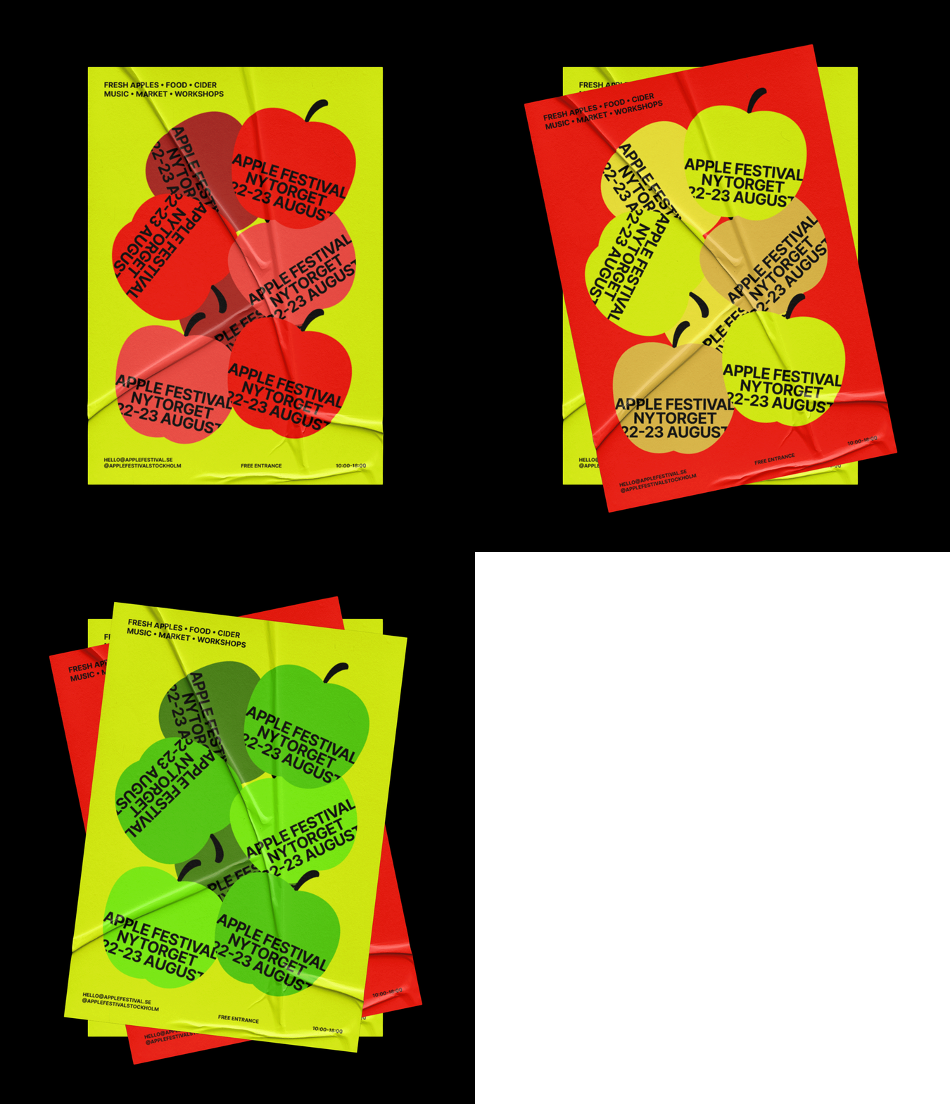
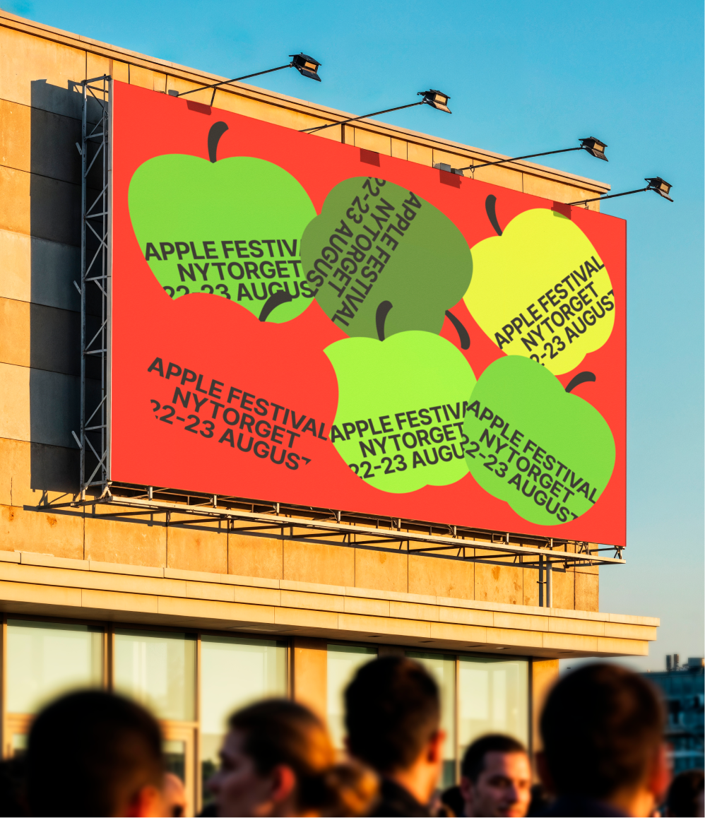
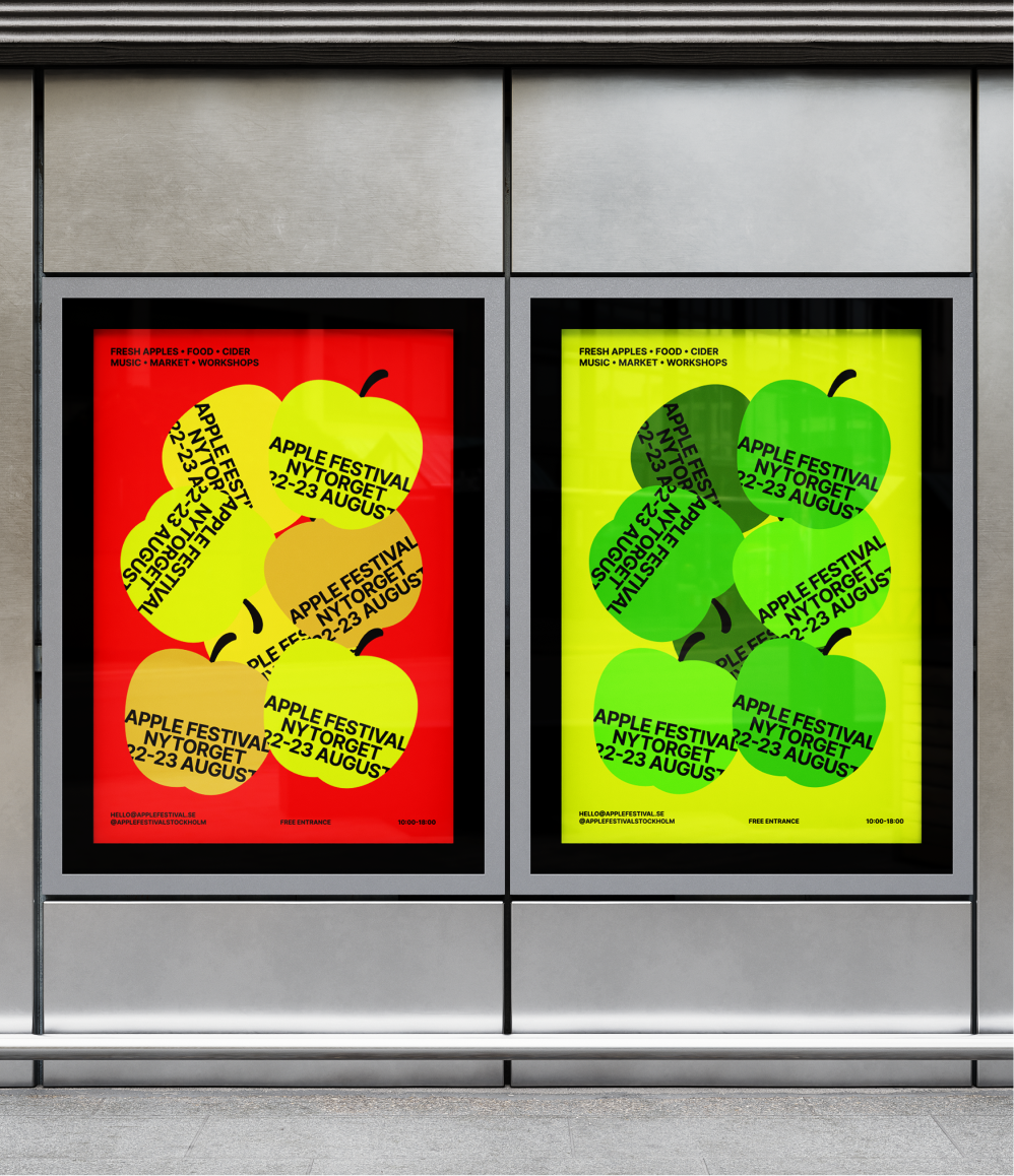
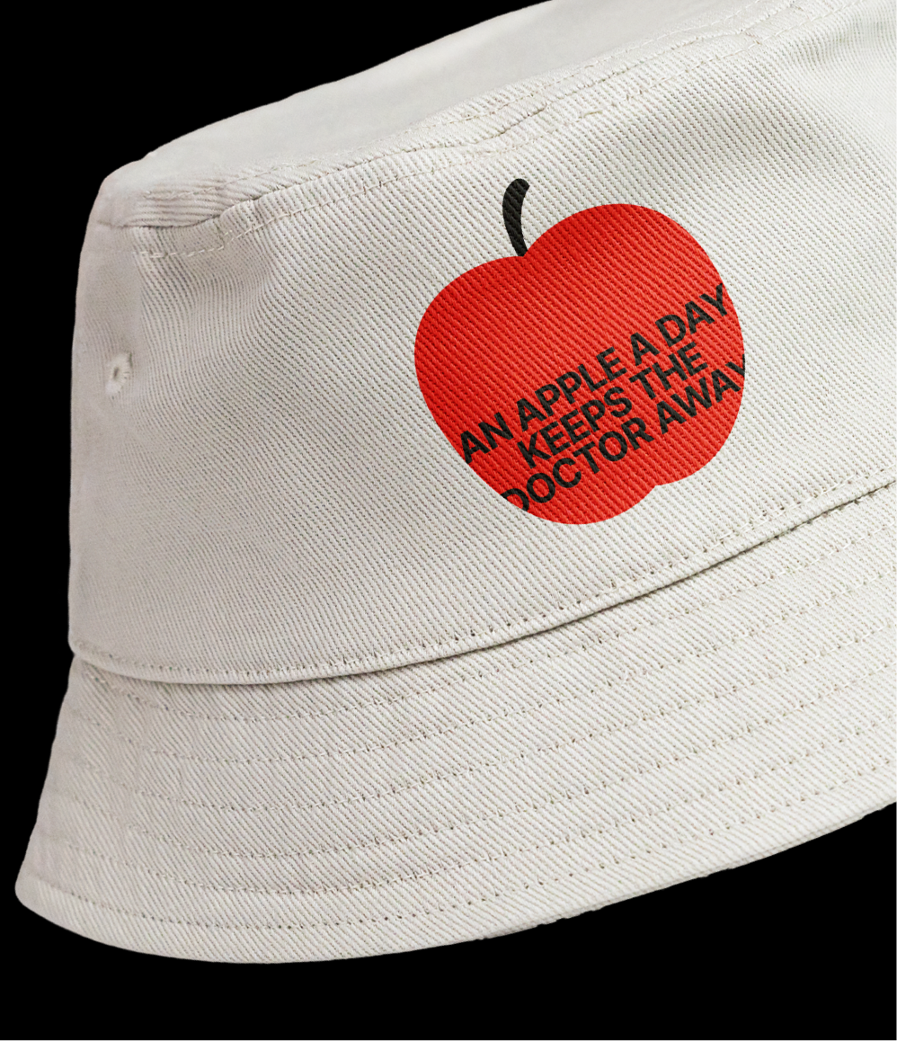
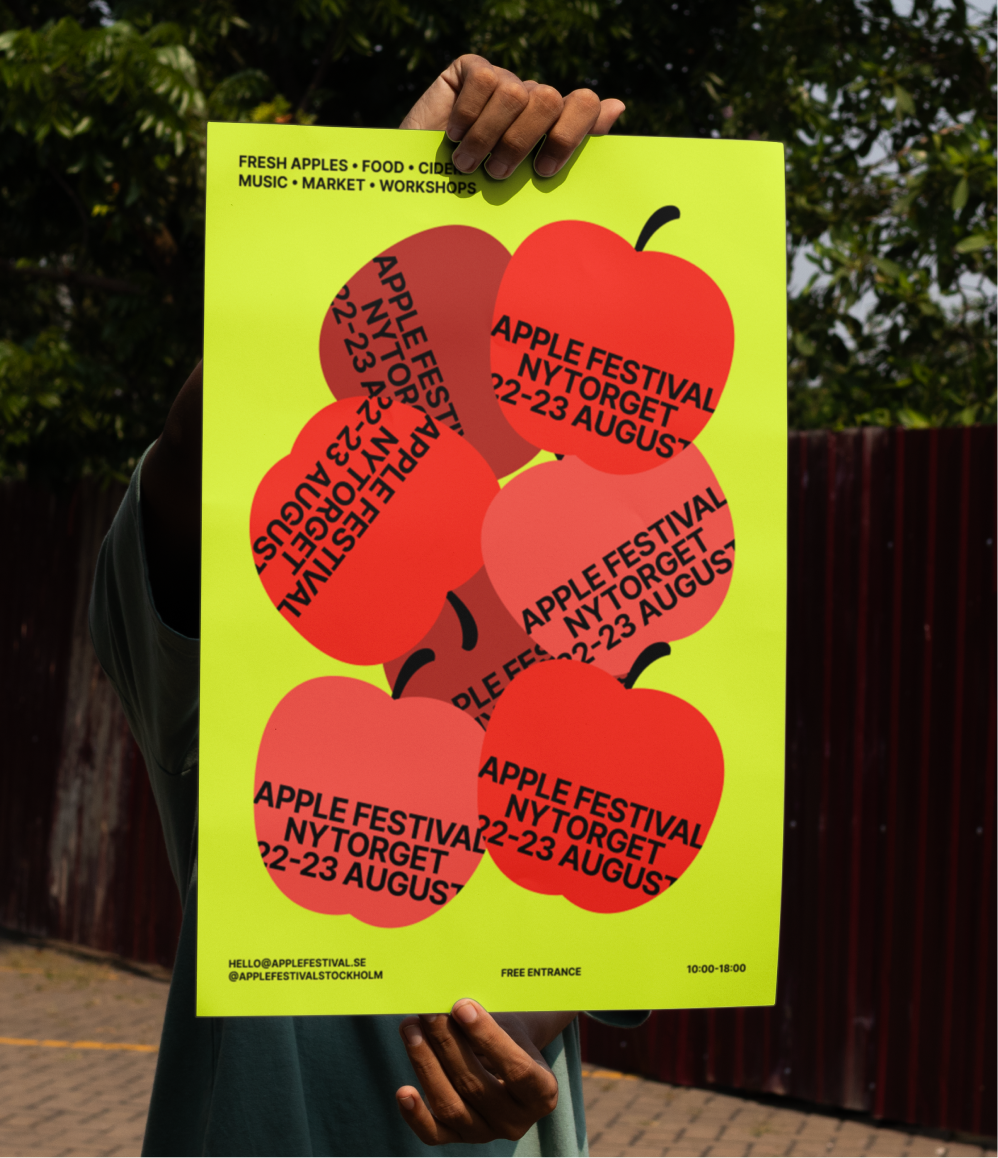
Apple Festival needed a presence that could command attention across signage, print, and outdoor applications — somewhere loud enough to compete with the noise of an outdoor event, but still coherent as a system.
The identity is built around layered fruit forms, high-contrast colour, and dynamic typography. Shapes overlap deliberately, typography leans and tilts rather than sitting still — giving the whole system a sense of motion, as if the festival is already happening before anyone arrives.
The effect is a visual presence that reads as abundance and energy at a glance — built to work from a banner at fifty metres just as well as it does on a printed flyer in your hand.
The identity is built around layered fruit forms, high-contrast colour, and dynamic typography. Shapes overlap deliberately, typography leans and tilts rather than sitting still — giving the whole system a sense of motion, as if the festival is already happening before anyone arrives.
The effect is a visual presence that reads as abundance and energy at a glance — built to work from a banner at fifty metres just as well as it does on a printed flyer in your hand.
A festival identity designed to hit hard on the street. Layered fruit forms, high-contrast color, and dynamic typography built for immediate impact at scale.
Apple Festival
Brand
Visual Identity
Category
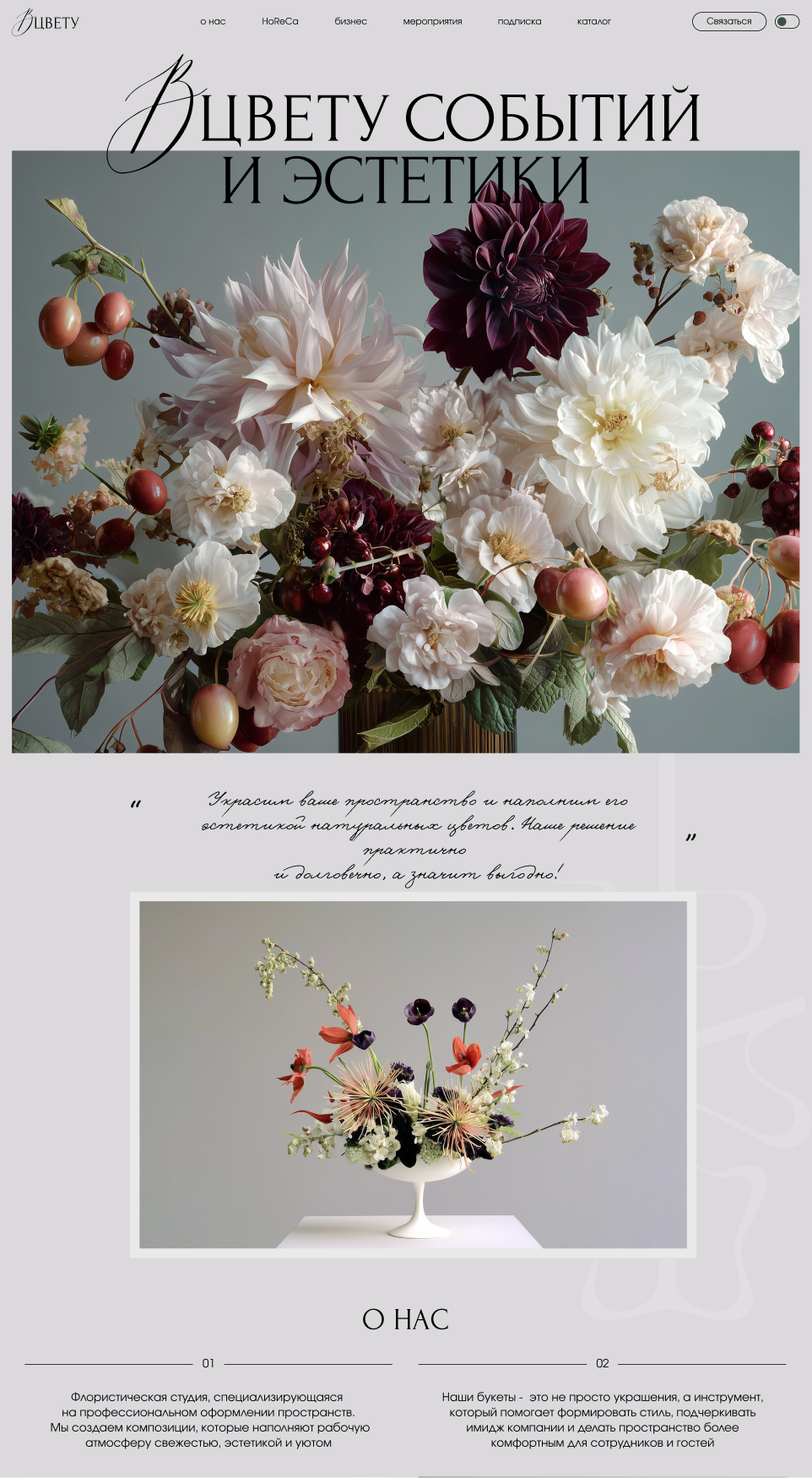
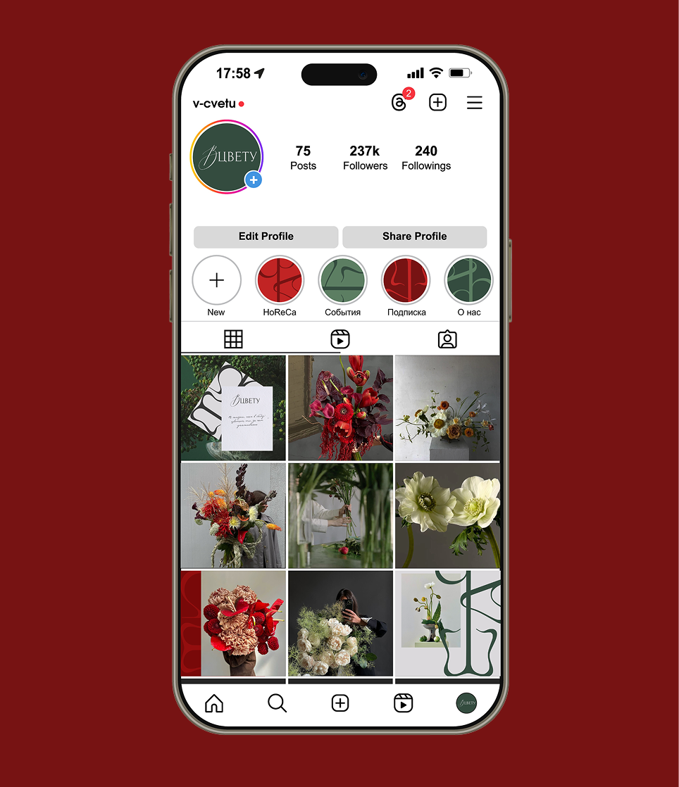
V Cvetu is a floral studio offering events, corporate floristry, and subscriptions. The category was crowded with botanical illustration and soft romantic aesthetics — most competitors looked similar. Together with the client, the decision was to step away from that entirely and build an identity that didn't lean on flowers to be recognisable.
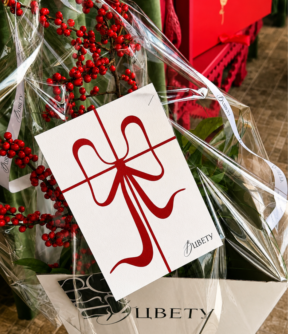
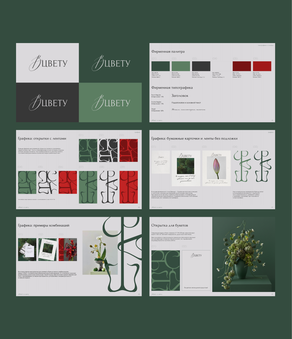
During research, one decision shaped everything that followed: keep flowers out of the identity system itself. Instead, the focus shifted to what surrounds flowers rather than the flowers themselves — the rituals, the gestures, the moment before a gift is opened. The ribbon emerged as the clearest visual metaphor — it reads as gifting, anticipation, and celebration, without relying on the product to carry the meaning. From there, it grew into a flexible graphic language that works as a symbol, a framing device, a pattern, and a compositional element across every touchpoint.
The result is an identity that stands out precisely because it refuses to do what every competitor does — applied consistently across logo, brand guidelines, website, social templates, and floral cards. The identity is currently live across all touchpoints.
During research, one decision shaped everything that followed: keep flowers out of the identity system itself. Instead, the focus shifted to what surrounds flowers rather than the flowers themselves — the rituals, the gestures, the moment before a gift is opened. The ribbon emerged as the clearest visual metaphor — it reads as gifting, anticipation, and celebration, without relying on the product to carry the meaning. From there, it grew into a flexible graphic language that works as a symbol, a framing device, a pattern, and a compositional element across every touchpoint.
The result is an identity that stands out precisely because it refuses to do what every competitor does — applied consistently across logo, brand guidelines, website, social templates, and floral cards. The identity is currently live across all touchpoints.
A floral identity built around the gesture, not the product. The ribbon (not flowers) became the brand.
Offbeat Studio for V Cvetu
Brand
Brand strategy, Brand Identity
Category
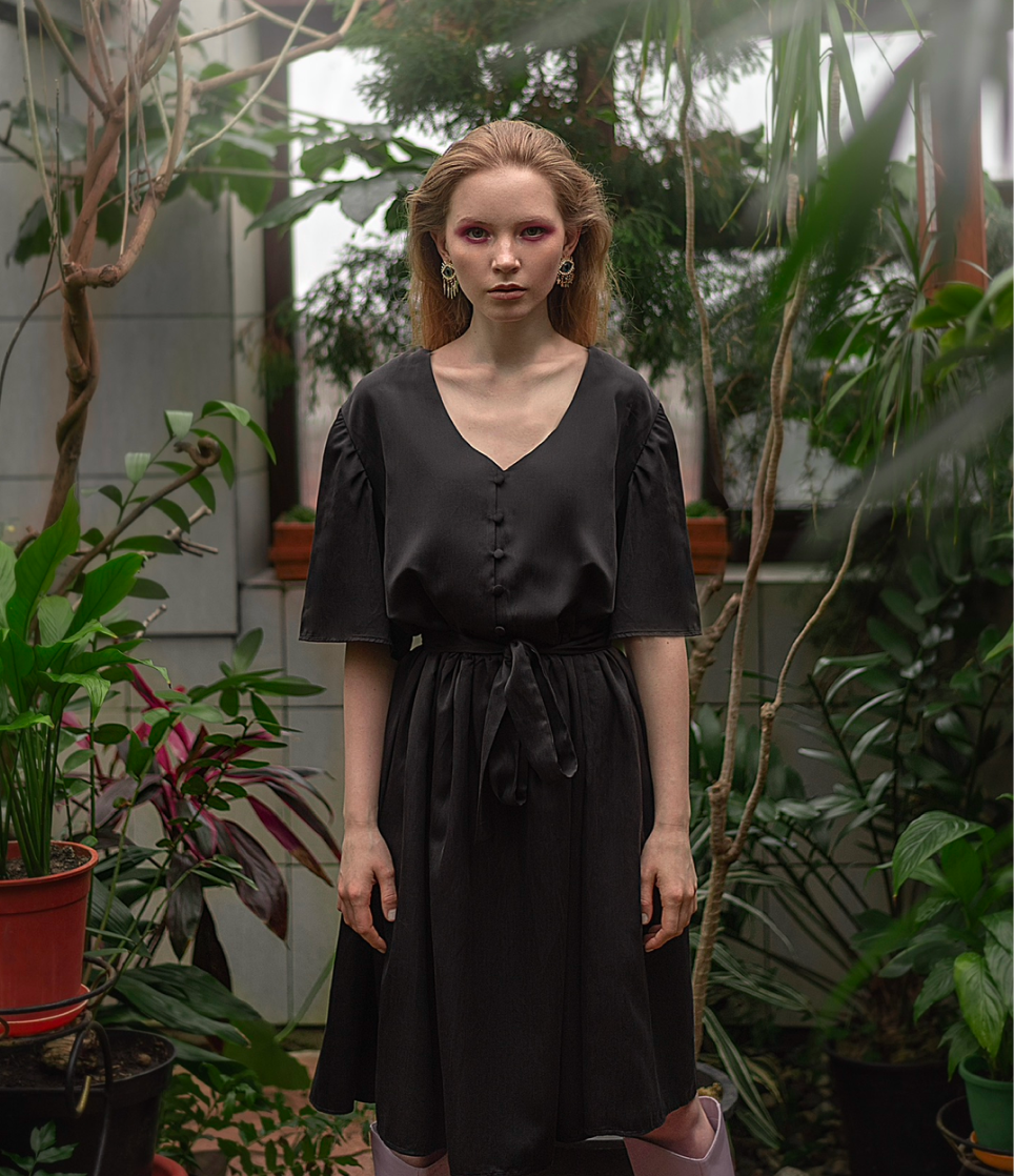
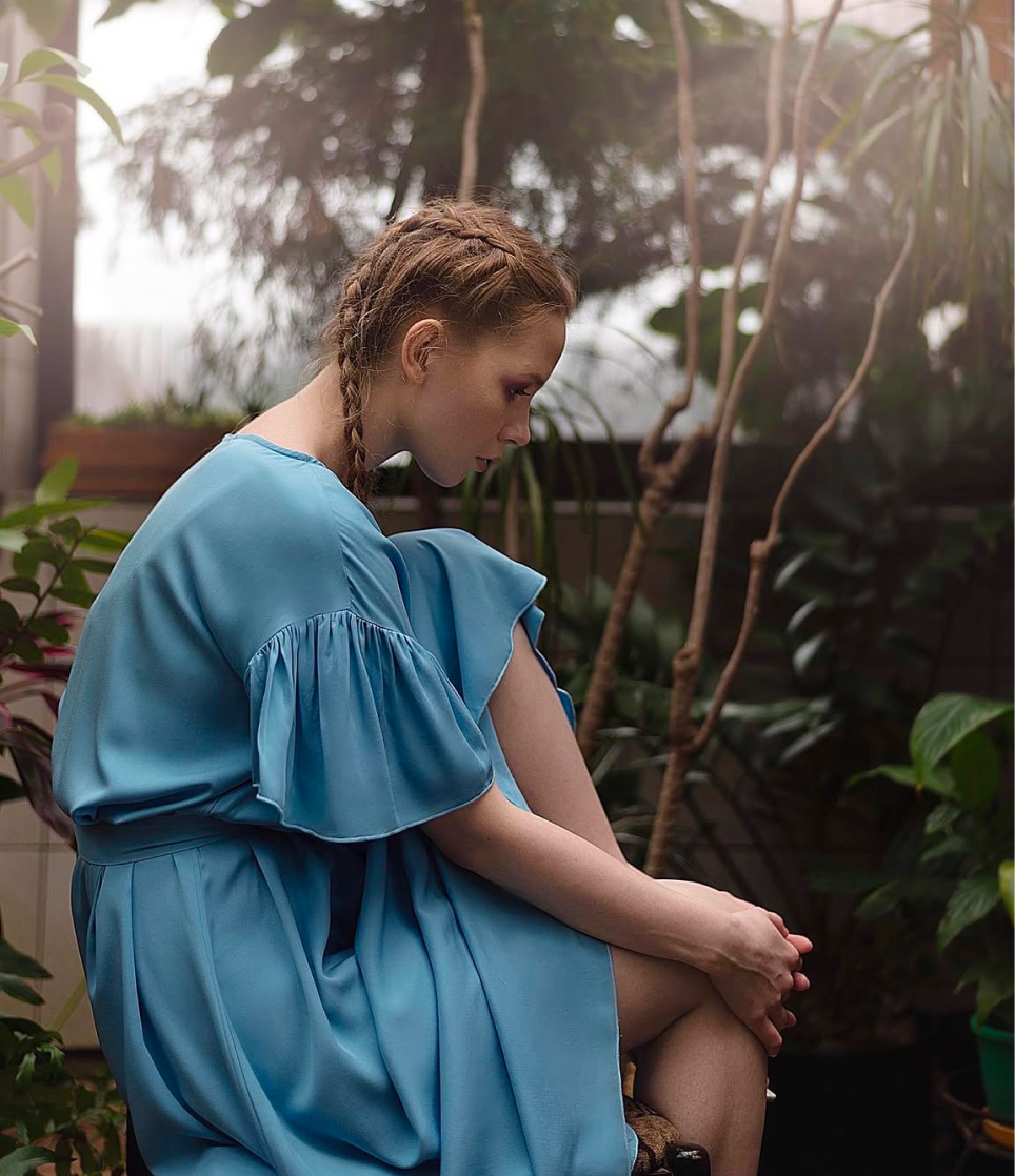
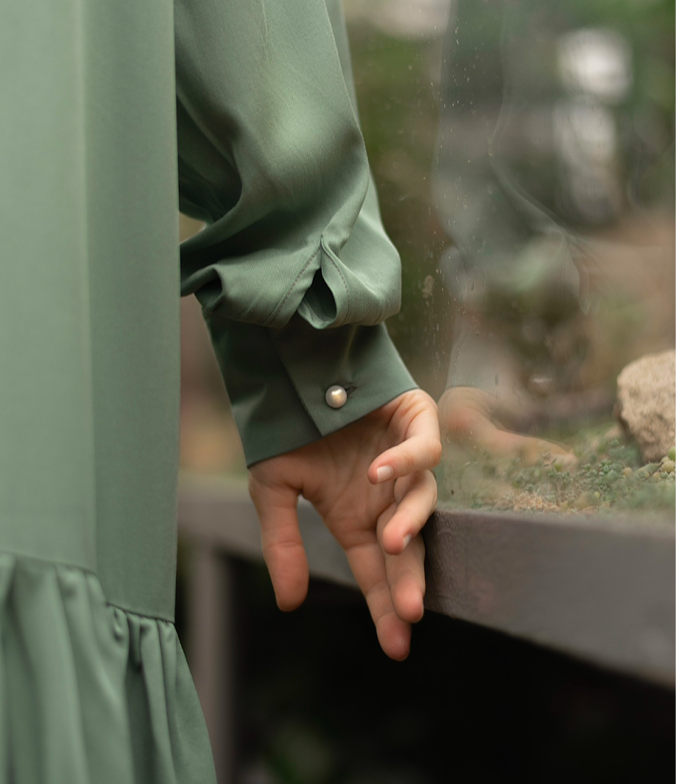
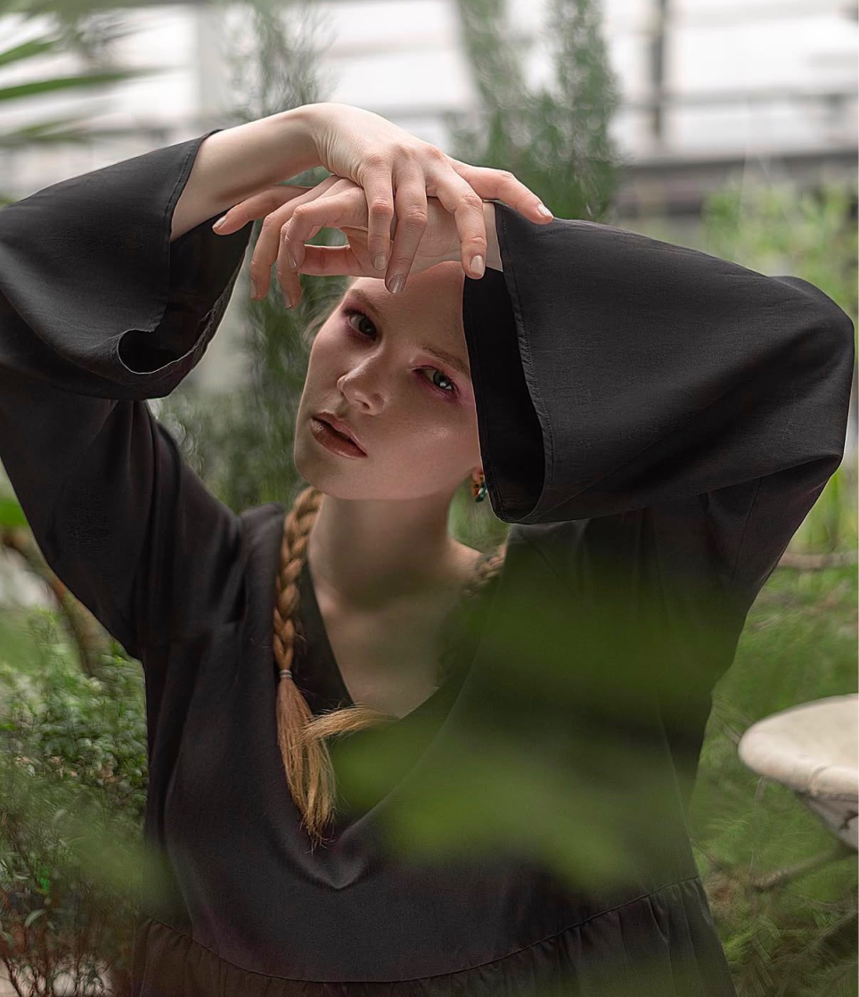
Ást was as much a branding exercise as it was a fashion brand. Every decision started from a defined creative position — romantic, natural, unhurried — and that position shaped a consistent visual language across campaign imagery, art direction, packaging, and the garments themselves.
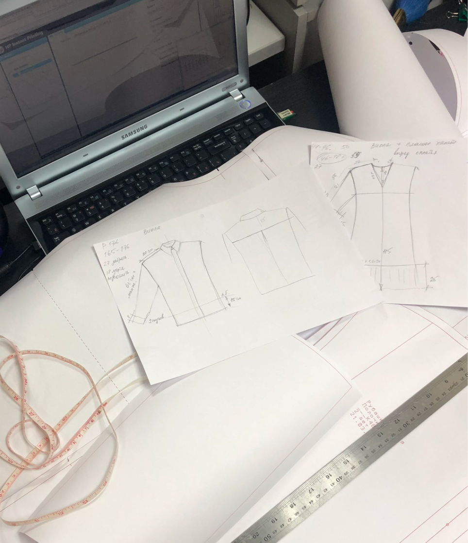
I briefed and directed a team of freelance photographers, stylists, and an illustrator, translating the brand's aesthetic into shoots and visuals rather than leaving interpretation to chance. On the product side, I designed the collections, sourced fabrics personally, and worked directly with local manufacturers through sampling — which gave me an unusually close understanding of how design decisions translate into a physical object. Running the brand for three years meant consistently making the kind of decisions that are typically split between a creative director, a brand designer, and a producer.
Three years and multiple collections later, the brand had a loyal customer base that grew organically — built entirely on the strength of the creative work rather than paid acquisition.
I briefed and directed a team of freelance photographers, stylists, and an illustrator, translating the brand's aesthetic into shoots and visuals rather than leaving interpretation to chance. On the product side, I designed the collections, sourced fabrics personally, and worked directly with local manufacturers through sampling — which gave me an unusually close understanding of how design decisions translate into a physical object. Running the brand for three years meant consistently making the kind of decisions that are typically split between a creative director, a brand designer, and a producer.
Three years and multiple collections later, the brand had a loyal customer base that grew organically — built entirely on the strength of the creative work rather than paid acquisition.
Full creative ownership: brand identity, art direction, and garment design built and run from the ground up over three years.
Ást
Brand
Visual Identity
Category
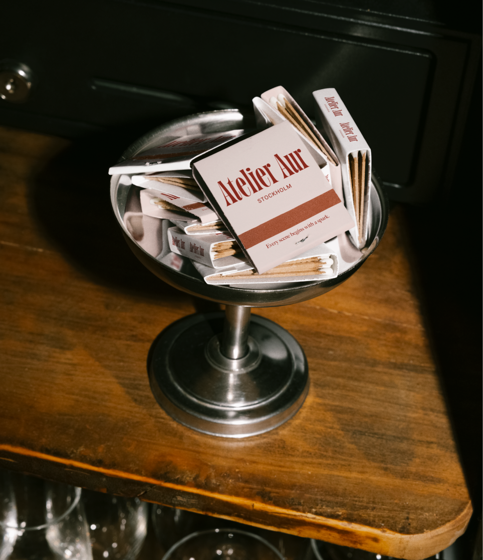
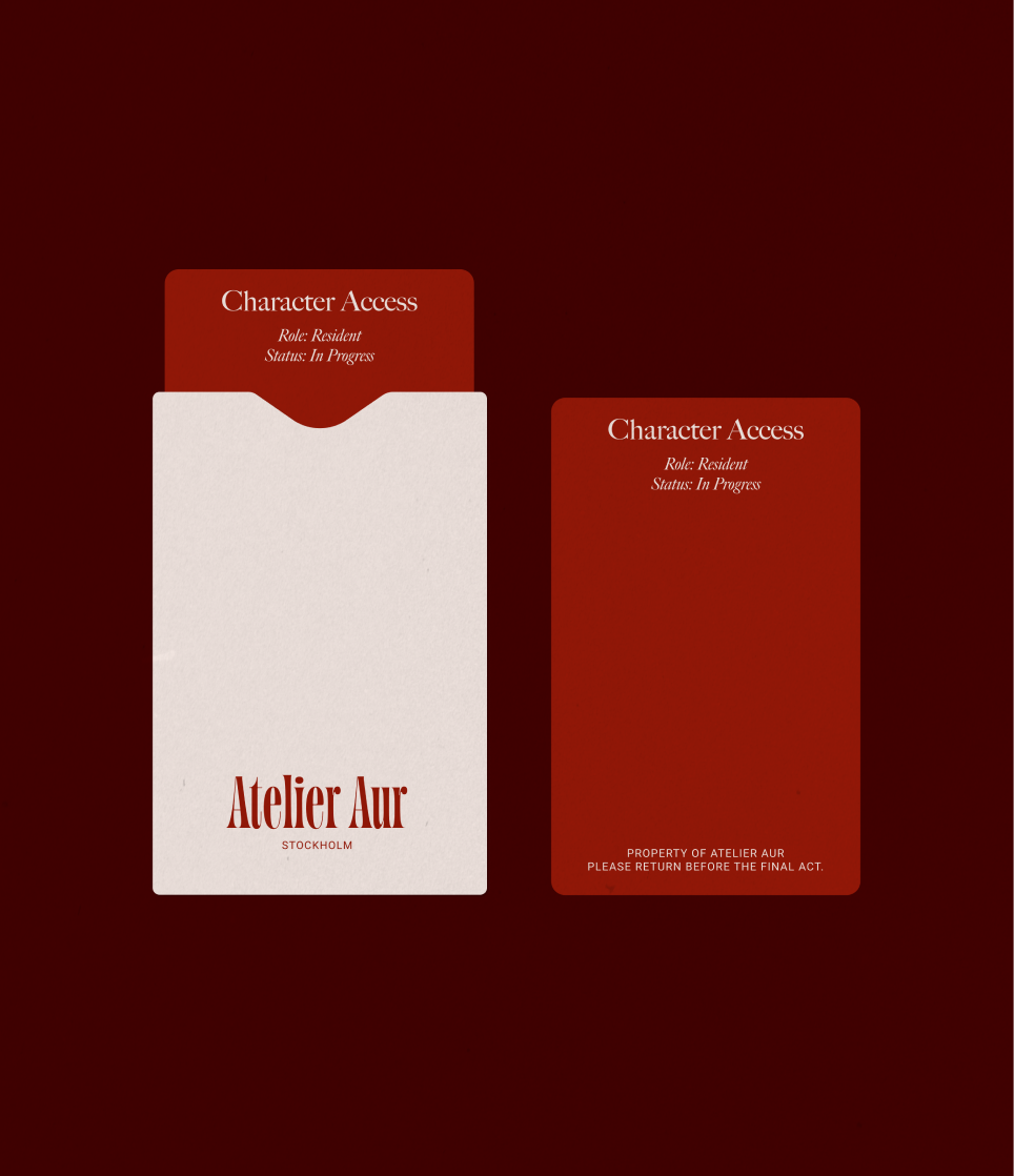
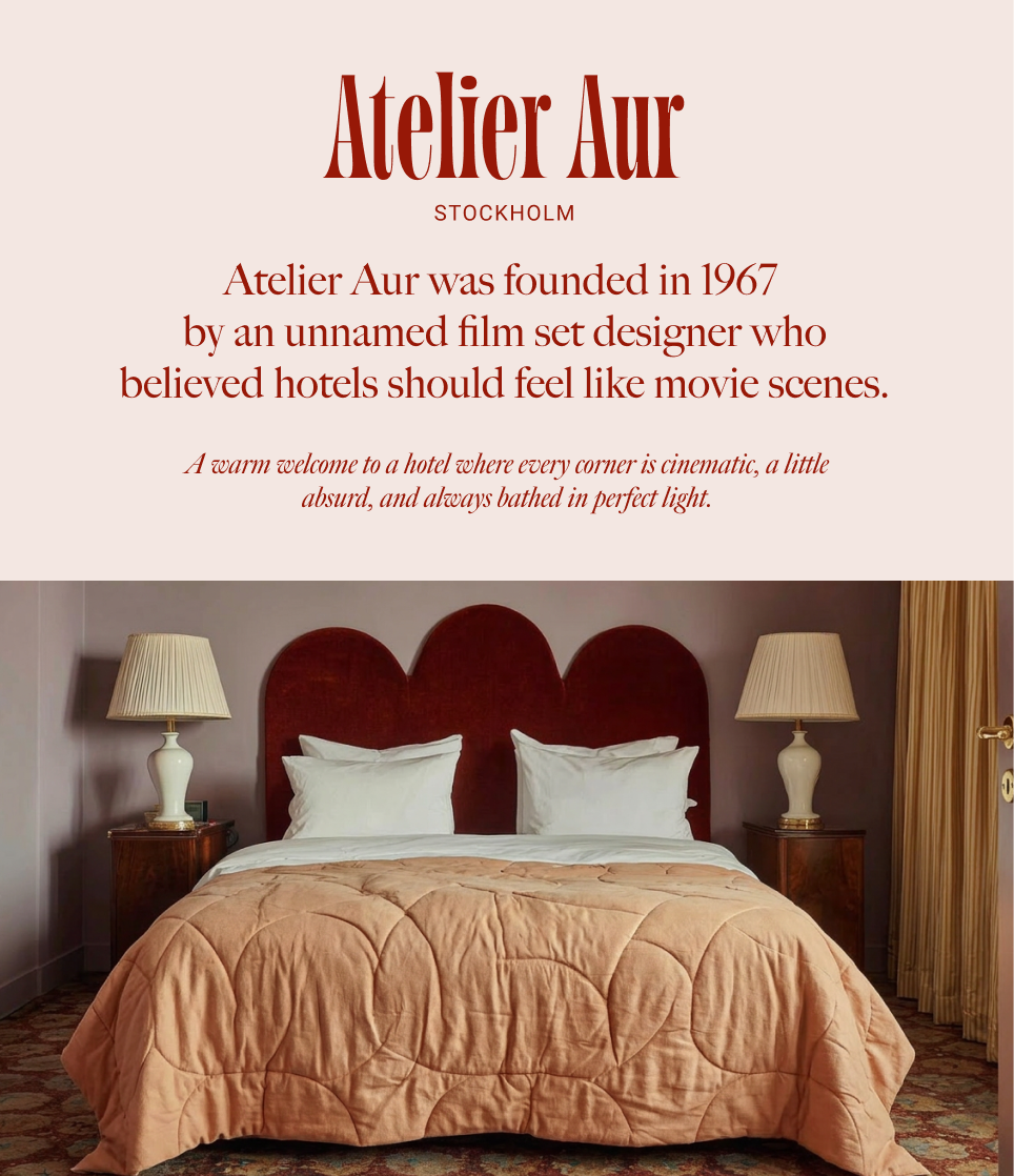
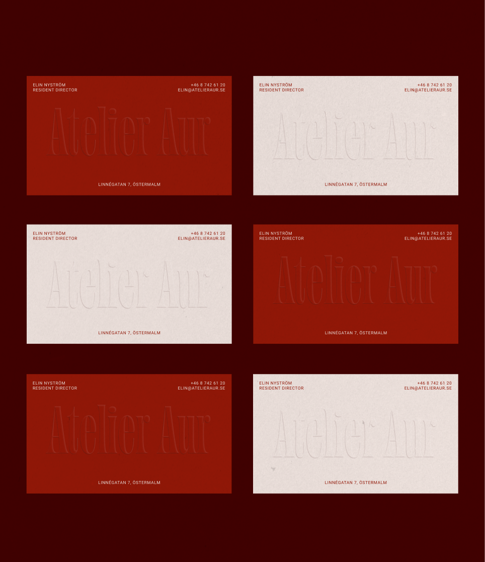
Atelier Aur is a cinematic boutique hotel in Stockholm, built on a single governing metaphor: the hotel as an unfolding film. Every decision in the identity flows from that one idea rather than from a typical hospitality brief.
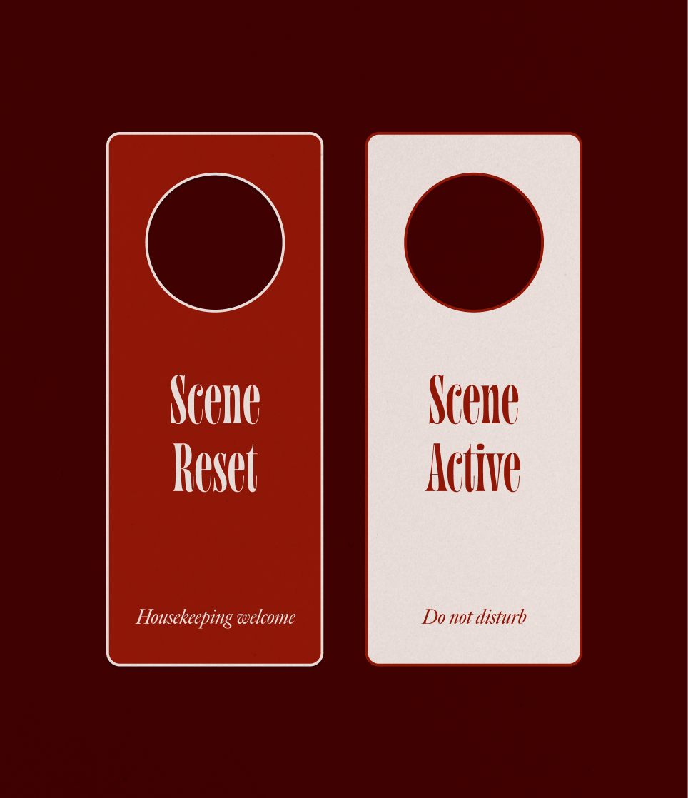
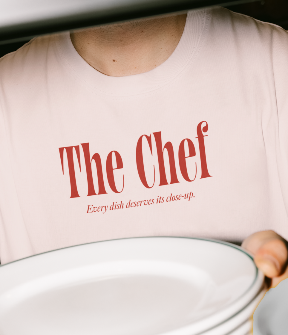
Editorial typography opens each touchpoint like opening credits. Microcopy reads like screenplay direction rather than hotel signage. Print materials and physical signage were designed as props from the same production — consistent, deliberate, never decorative for its own sake. The concept isn't an idea layered on top of the design; it's the structure the design was built from.
The concept isn't an idea layered on top of the design — it's the structure the whole identity was built from, a hospitality brand with a distinctive voice, built less like a hotel and more like a world someone could step into.
Editorial typography opens each touchpoint like opening credits. Microcopy reads like screenplay direction rather than hotel signage. Print materials and physical signage were designed as props from the same production — consistent, deliberate, never decorative for its own sake. The concept isn't an idea layered on top of the design; it's the structure the design was built from.
The concept isn't an idea layered on top of the design — it's the structure the whole identity was built from, a hospitality brand with a distinctive voice, built less like a hotel and more like a world someone could step into.
A boutique hotel identity built around one idea: the hotel as a film set. Where rooms become scenes, guests become characters, and every touchpoint feels like a prop from the same movie.
Atelier Aur
Brand
Visual Identity & Content Direction
Category
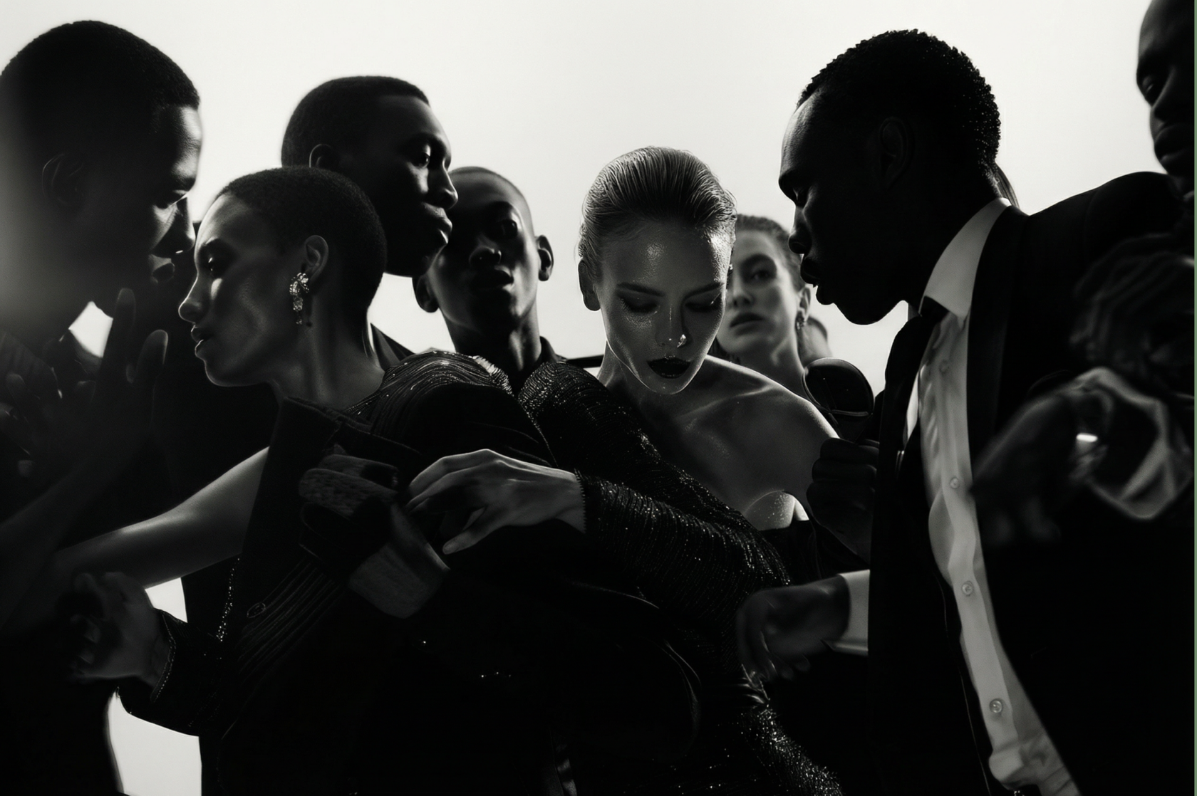
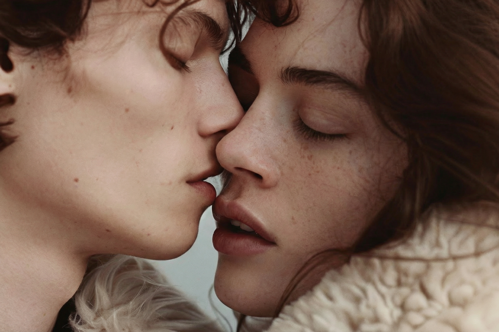
Geil, a sexual wellness brand, needed a visual content library that could scale across digital channels without losing creative control — built using AI image generation, developed during my time as Creative & Brand Project Manager at the company.
The real challenge wasn't generating images, it was consistency — making every image feel like it belonged to the same visual world in lighting, skin tones, mood, and composition. The process combined prompt engineering, iterative refinement, and post-production, treating AI as a production tool rather than a creative decision-maker. The visuals center on human subjects, expressing intimacy, softness, and body confidence in line with the brand's values of inclusivity and pleasure.
Deployed across the brand's digital channels and marketing materials, the library stands as proof that AI can accelerate creative production without sacrificing intentionality or coherence.
The real challenge wasn't generating images, it was consistency — making every image feel like it belonged to the same visual world in lighting, skin tones, mood, and composition. The process combined prompt engineering, iterative refinement, and post-production, treating AI as a production tool rather than a creative decision-maker. The visuals center on human subjects, expressing intimacy, softness, and body confidence in line with the brand's values of inclusivity and pleasure.
Deployed across the brand's digital channels and marketing materials, the library stands as proof that AI can accelerate creative production without sacrificing intentionality or coherence.
AI-generated imagery that doesn't look AI-generated. A cohesive visual library built through prompt engineering, iterative refinement, and post-production; creative direction first, technology second.
Geil (SSE Business Lab)
Brand
Posters
Category
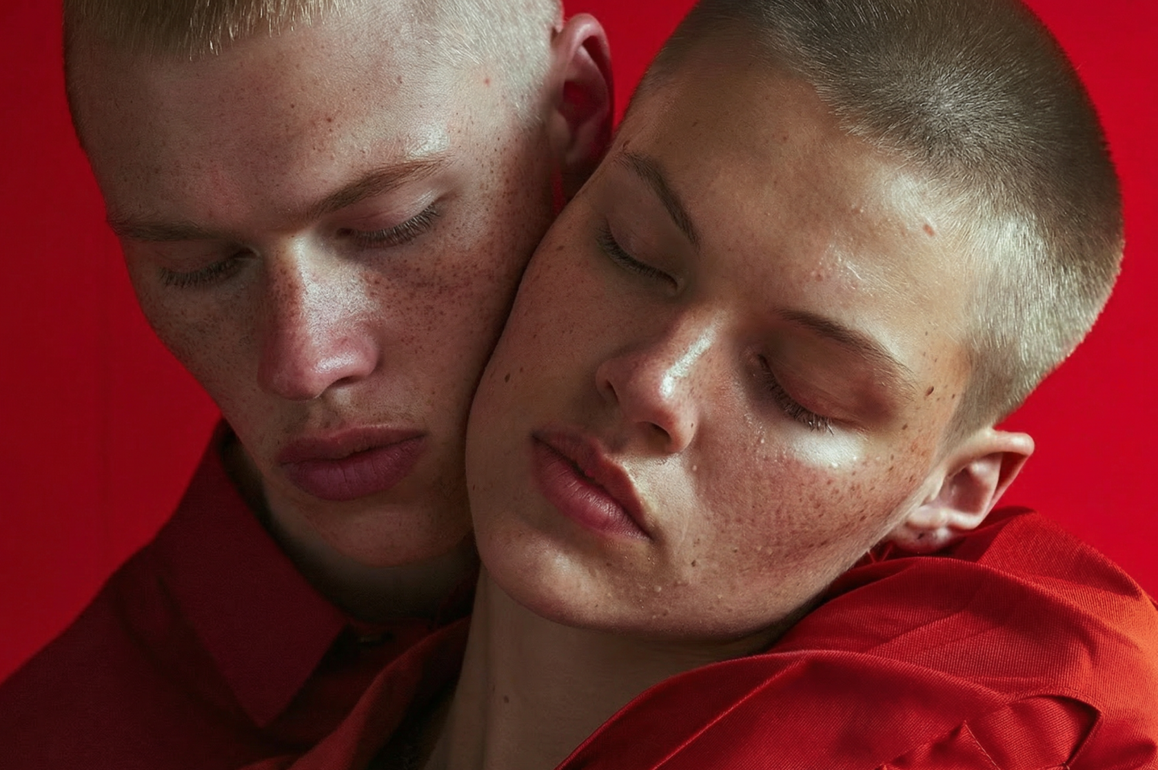
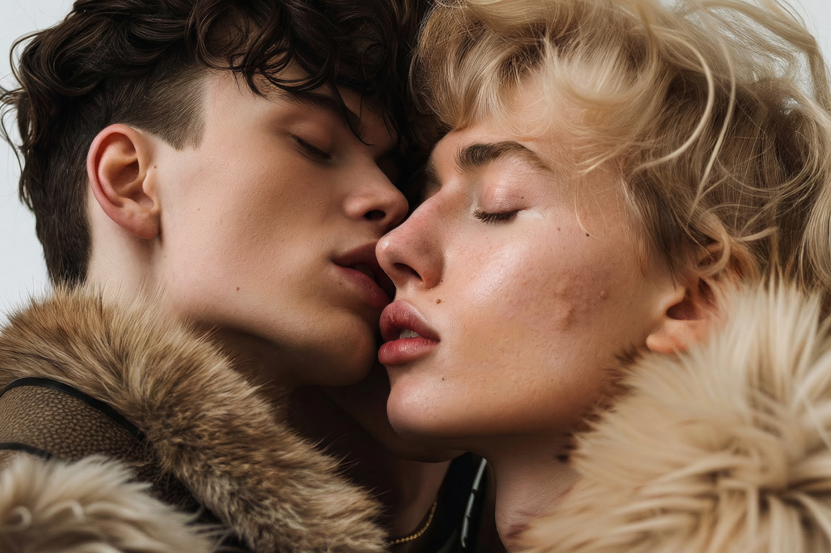
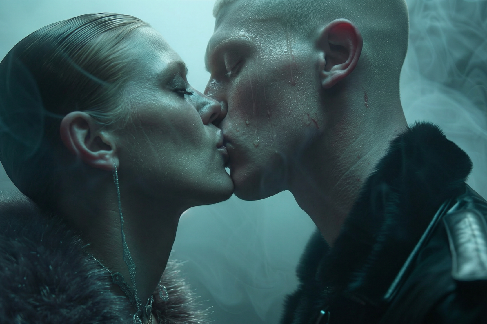
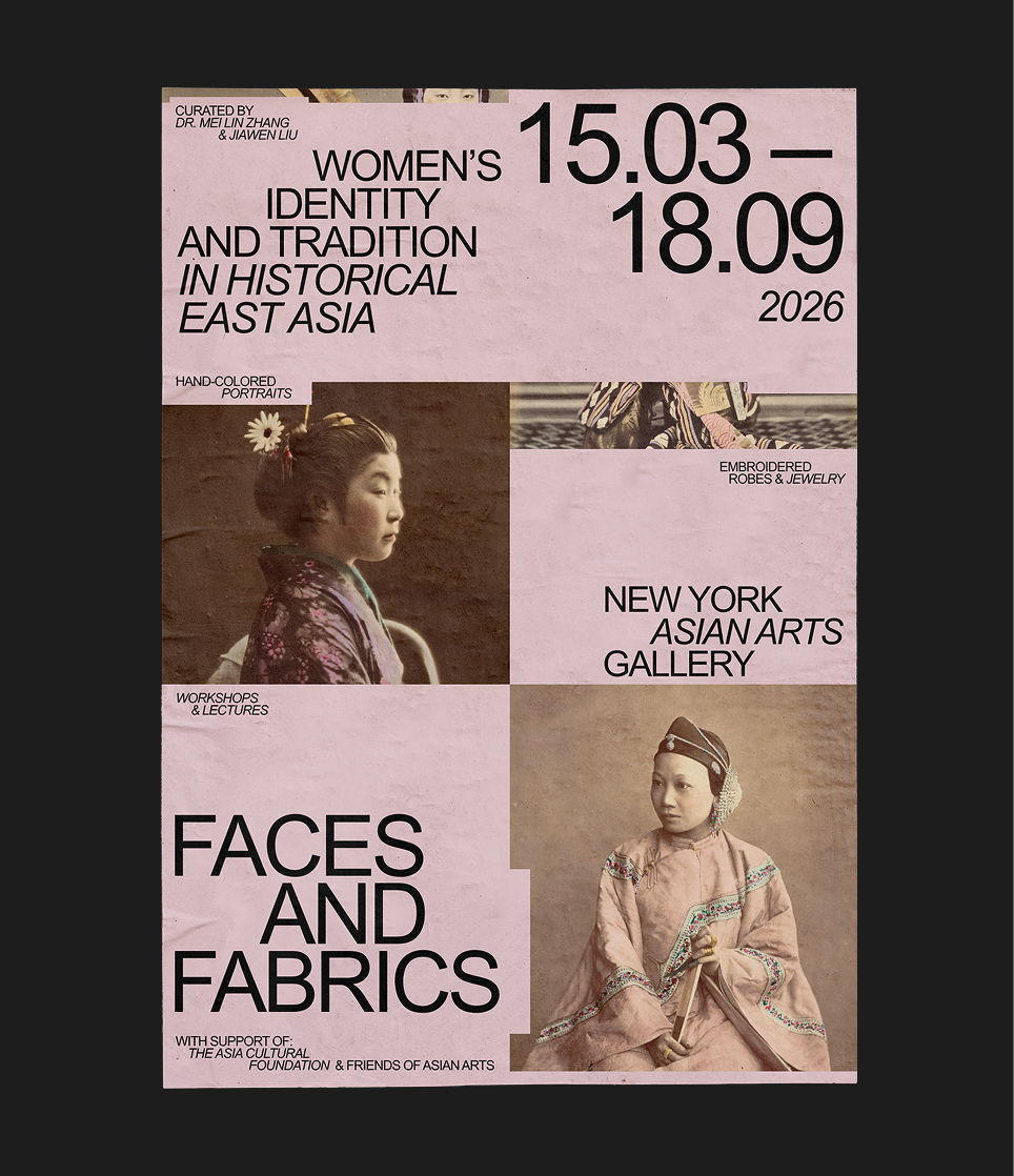
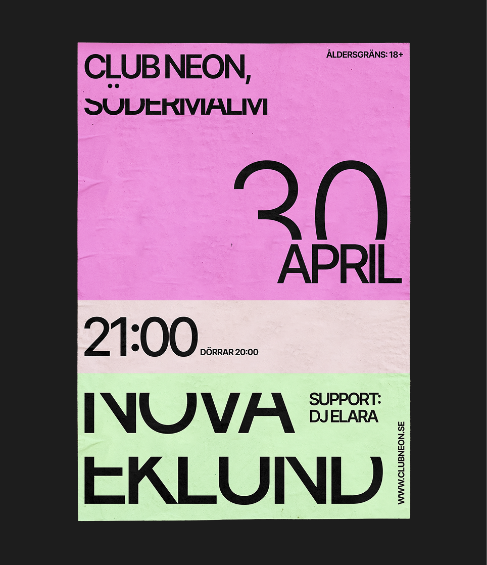
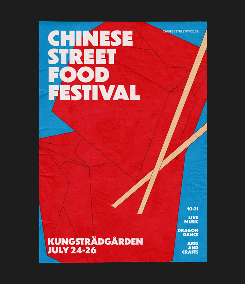
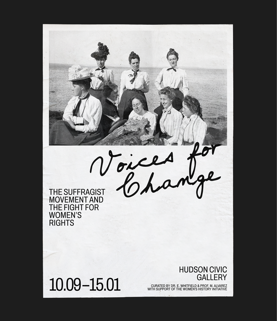
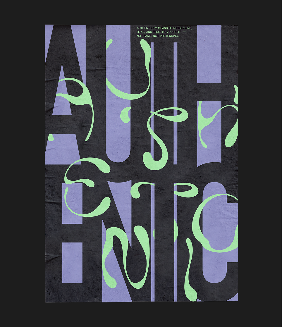
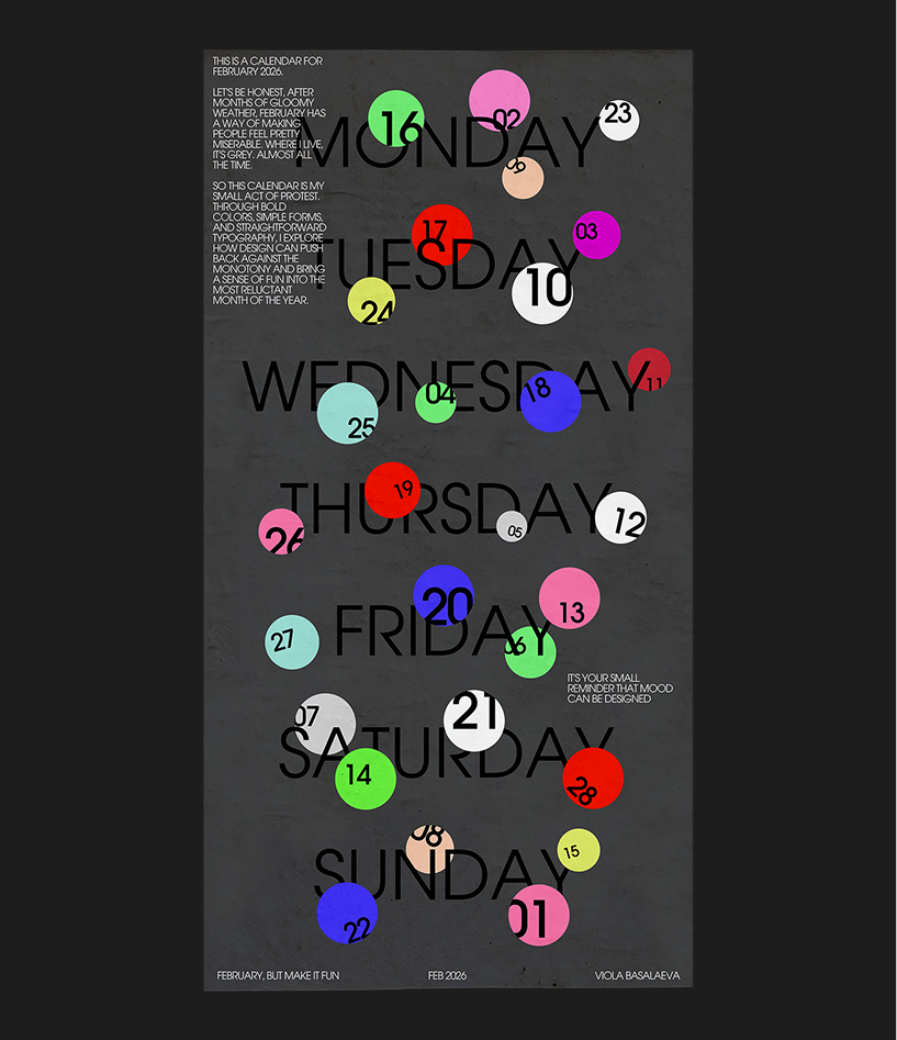
Poster Lab is a self-initiated series exploring typography, spacing, and layout as tools for visual storytelling — built outside any client brief, on purpose.
Each poster starts with a single question: about tension, rhythm, hierarchy, or negative space.
References come from outside design entirely — architecture, editorial layouts, film stills — anywhere the same problems show up in a different language. The constraint is deliberate: by limiting each study to one problem at a time, the thinking stays visible in the work rather than disappearing into a polished final result.
What started as a way to sharpen the eye has become a kind of training ground — the same reasoning that shows up clearly here is what drives every client project, just without a brief setting the terms.
Each poster starts with a single question: about tension, rhythm, hierarchy, or negative space.
References come from outside design entirely — architecture, editorial layouts, film stills — anywhere the same problems show up in a different language. The constraint is deliberate: by limiting each study to one problem at a time, the thinking stays visible in the work rather than disappearing into a polished final result.
What started as a way to sharpen the eye has become a kind of training ground — the same reasoning that shows up clearly here is what drives every client project, just without a brief setting the terms.
Personal studies in how type and composition tell stories. Each poster investigates one question — about scale, rhythm, hierarchy, and how subtle decisions shape meaning.
N/A
Brand
About me
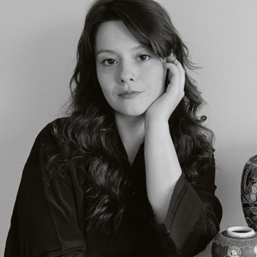
I'm a brand designer working across visual identity, art direction and brand systems.
Before formally training I founded a sustainable fashion brand, owning the full visual identity, art direction, campaign shoots, and the garments themselves and managed a full commercial rebrand for a startup, from research and stakeholder interviews through to final delivery. That background shapes how I approach every project. I think about the strategy, the process, and the outcome, not just how something looks.
Open to new roles in Stockholm where craft and strategic thinking sit side by side.
Before formally training I founded a sustainable fashion brand, owning the full visual identity, art direction, campaign shoots, and the garments themselves and managed a full commercial rebrand for a startup, from research and stakeholder interviews through to final delivery. That background shapes how I approach every project. I think about the strategy, the process, and the outcome, not just how something looks.
Open to new roles in Stockholm where craft and strategic thinking sit side by side.
e-mail
violabasalaeva@gmail.com
phone
+46 76 719 83 59
linkedin
Viola Basalaeva
telegram
@violabasal
Contacts